

Are our surroundings becoming a paler shade of beige, as a study observed? We ask those elbow-deep in many-hued professions

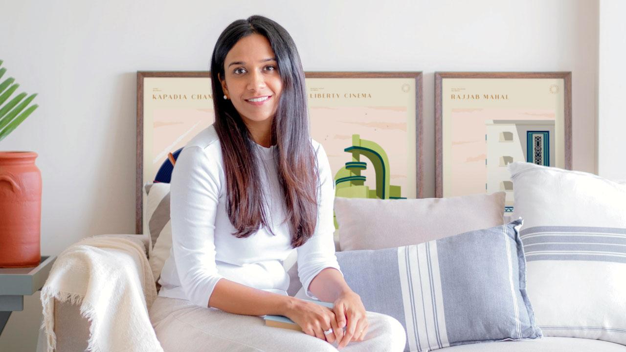
There is so much visual chaos today, especially on social media, that people want less of it inside their residential spaces, says Mumbai-based interior designer Kumpal Vaid
Last month, a viral post on Twitter by The Cultural Tutor (@culturaltutor) argued how the world has become less colourful over the last two centuries. The observations were based on a study funded by UK-based Creative Industries Policy and Evidence Centre (PEC). Data scientists studied 7,000 photographs of objects in 21 categories (largely everyday and familiar objects, such as home appliances, telephones, etc). The objects were part of the collection belonging to the Science Museum Group. The study observed that greyscale colour (shades of grey) now make up three quarters of cars produced globally, compared to less than 50 per cent in the past; and that neutral colours are by far the most popular in clothing, or when painting homes and buying a carpet.
“Nudes and greys are very much colours,” insists Amit Syngle, MD and CEO of Asian Paints. “In fact, they are a nuanced set of shades, the complexity in undertones makes them interesting and likeable. The range of colours isn’t limited to bright reds and vibrant yellows. Colours with calm characteristics have their own charm and can stimulate differently.”
The paint manufacturing company has been studying colour and its influence for several years. Commenting on the behavioural shift seen in the last two decades, Syngle says, “In the first decade of the 2000s, it was the rage to have a statement wall [in a bright colour]. Colour choices in the 1990s were in clusters. People were inspired by their neighbour’s home and entire colonies would be painted a signature colour. Today, customisation and self-expression drive decisions. Greens and teals dominated home décor in 2021, and this year, pinks and lavenders are popular choices.”
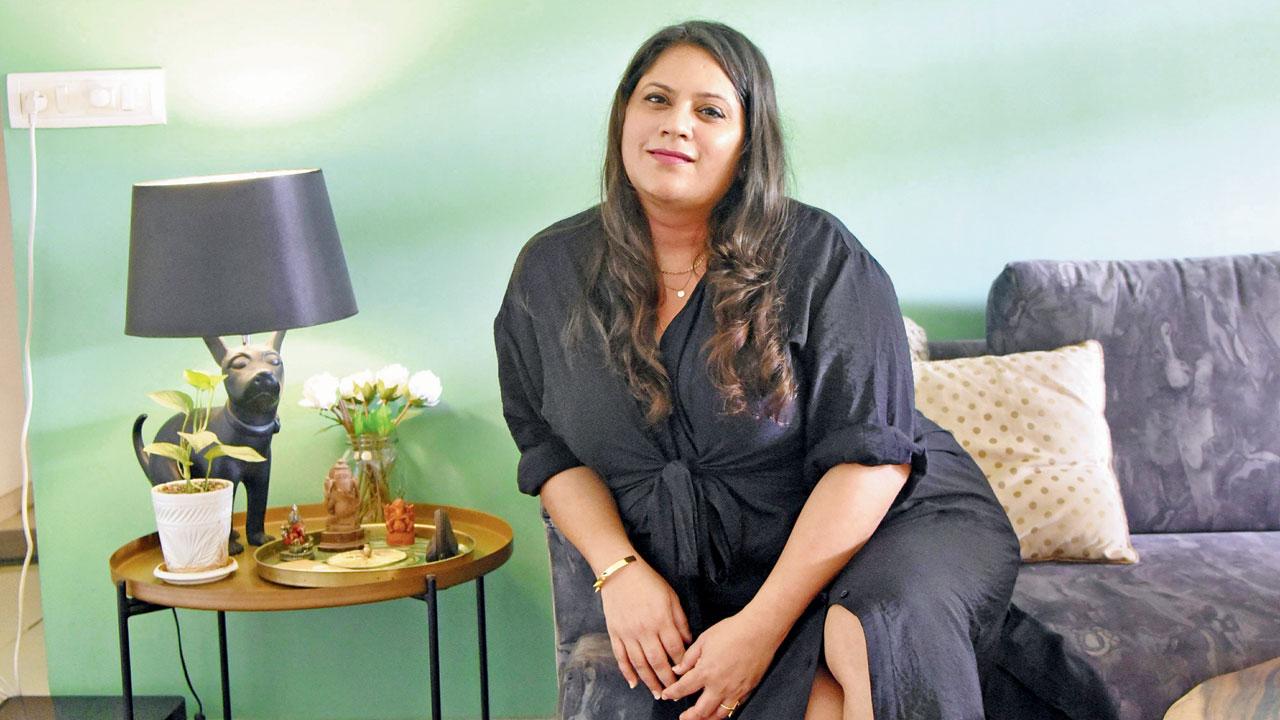
Hospitality designer Shweta Kaushik, who is the aesthete behind restaurants and dining spaces such as Bayroute, Hitchki and Woodside Inn, has her own personal space wrapped up in green. “I am usually bombarded by visual imagery of pattern and colour all day, thanks to my work. At home, I want an environment of serenity, and green is that colour for me. It’s calming and rejuvenating,” she says. PIC/SAMEER MARKANDE
There is so much visual chaos today, especially on social media, that people want less of it inside their residential spaces, says interior designer Kumpal Vaid, who is also the founder of the design studio Purple Backyard in Bandra West. “People prefer to come home to a calmer vibe,” she explains. “A decade ago, in the nascent stage of my career, primary colours and bold designs marked residential and recreation spaces. Somewhere along the way, we moved towards minimalism. However, in the Indian context, we are never purely minimalistic because we love our nooks and corners to feel a little homely and lived-in.”
Vaid feels the palette is more harmonious now. “I definitely see a bit of colour coming back every now and then, but it is more rhythmic. For instance, many tones [a term that refers to the degree of lightness or darkness of a shade] of one colour or many shades of cool colours come together, instead of mix and match or contrast. People prefer tranquillity.”
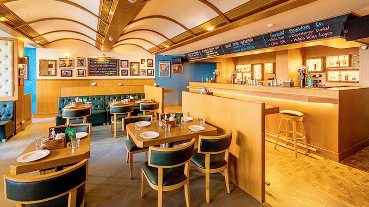
Woodside Inn, which is modelled after an English pub, has plenty of wooden elements. Kaushik say she added splashes of deep bottle green, but in a neutral tone so as to not be in your face; and paired it with a greyish tone of blue for contrast
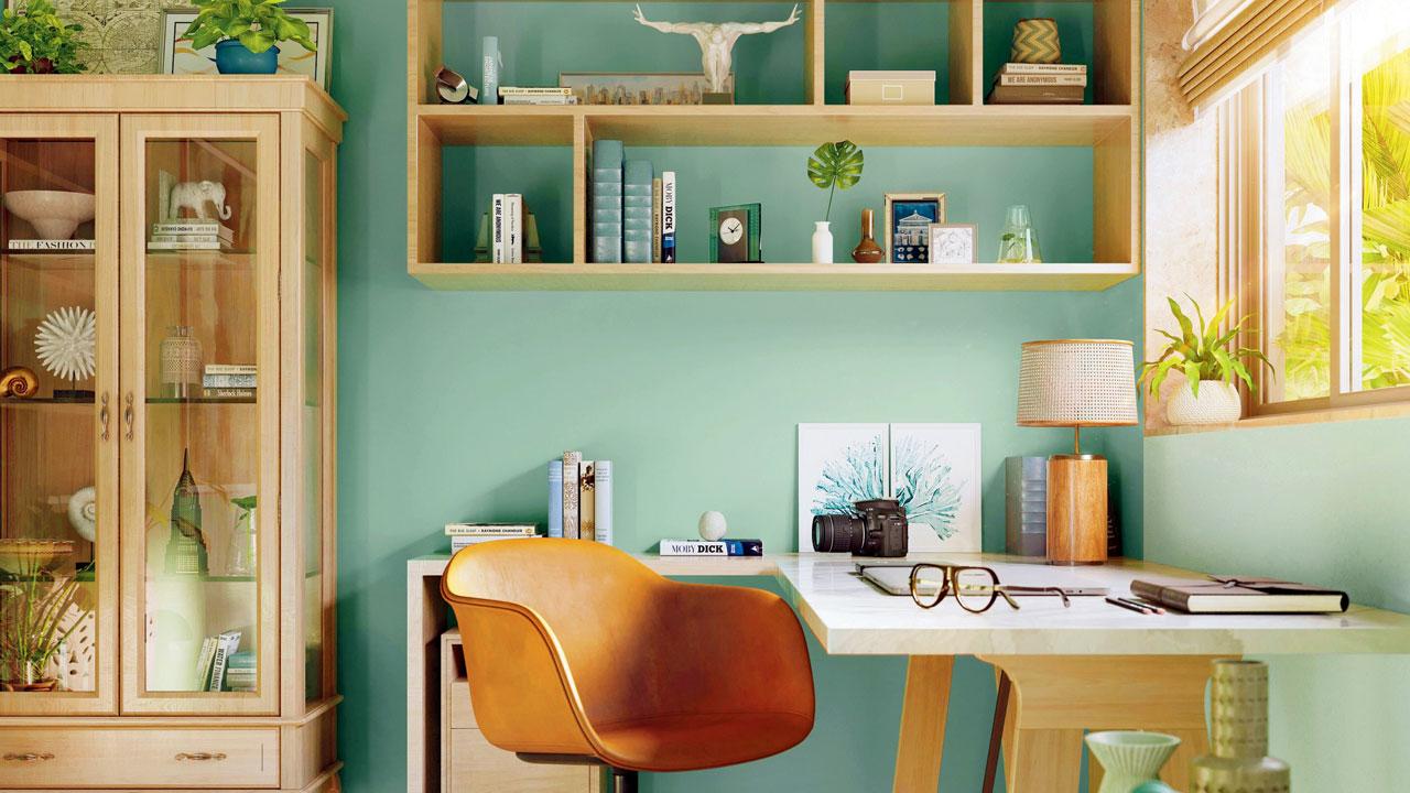
Shweta Kaushik, hospitality designer and founder of Mumbai-based design studio SKID, agrees: “About 20 years ago, Zen-style minimalist movement entered our lives. Grey became a very important neutral in that trend. Japandi, a blend of Scandinavian and Japanese design, became increasingly popular in home decor, but because of Japan’s stoicism, it became spartan and died down. Then came kitsch, which is all about eclectic colours and patterns. The move to cleaner lines and neutral earthy tones came after kitsch, and it offered a respite from the presiding opulent design of the time.” Kaushik says this seeded an acceptance of minimalism and soon, beige spoke of luxury and sophistication. “Even today, if you search for luxury homes on Pinterest, you’ll see a monochromatic, harmonious structure with beige marbles and fabrics.”
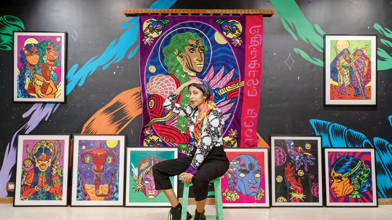
Vellore-based artist Osheen Siva, who creates futuristic artwork through murals, sculptures, digital art and fine art, works with an overarching palette featuring complementary, bright and bold colours
Kaushik accepts that even colour comes with a neutral tonality. Hotels tend to have a palette of browns, beiges, and greys to endure longer without frequent re-decorating, so that guests don’t get bored. “We are never barred from using colours in restaurants,” she says, “In fact, we are encouraged to use them to create a space where one blows off some steam after a tiring day. It is like giving an opportunity to escape, visually. I have used maroon, deep blue, rust, a nice shade of green to highlight and evoke certain emotions—you don’t want a calming vibe at a bar, you need energy. At fine dining restaurants, you want to create serenity and calmness, but with some eye-popping elements to make the place sing.”
Kaushik is the aesthete behind restaurants and dining spaces such as Bayroute, Hitchki, Olive Bar & Kitchen, and Woodside Inn. “The latter is modelled after an English pub so it has more wood elements,” she explains. “We added splashes of deep bottle green, but in a neutral tone so as to not be in your face; and paired it with a greyish tone of blue for contrast. We have to create a certain element of drama in restaurants.”
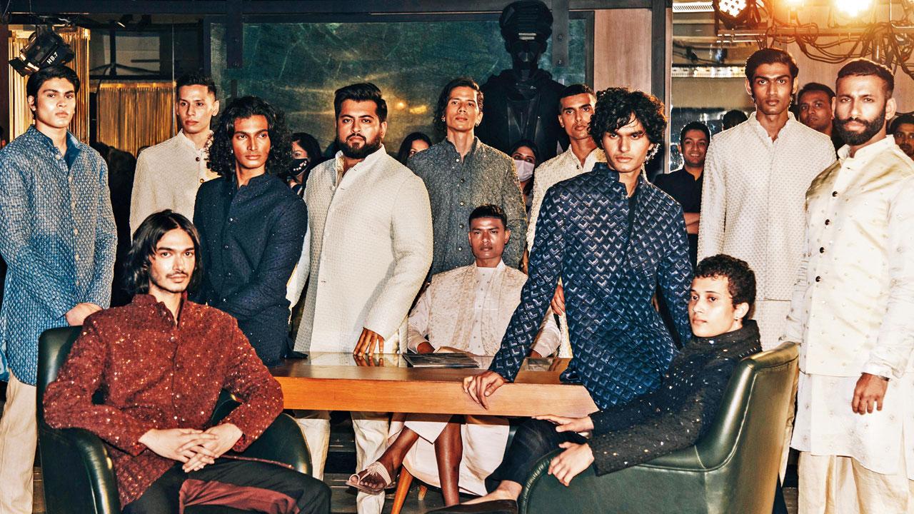
Fashion designer Kunal Rawal says that there been a shift in menswear as well. While earlier, pastels for men were also bold and bright, but now there is variety within them—whitewashed pastels, warmer pastels, pastels with a particular undertone. Rawal also says that when he designs a collection, he keeps a bunch of colours in mind to meet everyone’s demands
For residential spaces, Kaushik strives to stave off visual fatigue. “Colours are associated with moods.” She says. “Over time a sense of fatigue sets in, and it gets tiring and overwhelming. So for a home, where we spend more time, we draw from nature to incorporate earthy tones such as terracotta or greens such as pistachio, sage and olive, but not emerald. The current trend is browns and red, but in neutral tonality.”
Her own personal space is wrapped up in green. “I am usually bombarded by visual imagery of pattern and colour all day, thanks to my work. At home, I want an environment of serenity, and green is that colour for me. It’s calming and rejuvenating.”
Greens and teals dominated home décor in 2021, says Amit Syngle, MD and CEO of Asian Paints, adding that the range of colours is no longer limited to bright reds and vibrant yellows
There has been a shift in menswear as well, says Kunal Rawal, whose eponymous label offering luxury menswear has just celebrated 15 years in the industry. “Colours that weren’t accepted earlier are now being embraced,” is his opinion. “For instance, I always wanted to promote brown, but there was a misconception that it won’t work for Indian skin. If you ask me, it’s about the tone of the brown. Earlier, pastels for men were also bold and bright, but now there is variety within them—whitewashed pastels, warmer pastels, pastels with a particular undertone. There are more unique options within those colours. Men have also become more self-assured and open to experimenting in ethnic wear. Colours they like are chosen over trending ones. When I design a collection, I keep a bunch of colours in mind,” says Rawal. However, for weddings, Rawal urges clients to opt for classic neutral tones of ivory, champagne and beige. “In evening wear, we love shades of burgundy and wine.”

Vellore-based artist Osheen Siva doesn’t agree with the study. “I have always found everything around me to be colourful, bold and bright,” says the artist who works with an overarching palette featuring complementary, bright and bold colours. “A lot of colours are inspired by the neighbourhood I grew up in, so there’s a lot of nostalgia. Sometimes I use pastels and neons, inspired by the hand painted typography, architecture, and clothing. It helps explain the thought process behind my work. Different colours emote differently: Red is passionate and fiery, greens are calming. This helps portray and explain my concept better,” says Siva.
 Subscribe today by clicking the link and stay updated with the latest news!" Click here!