


IIT-B student devises interactive tool that could be the answer to inaccessible government data

Have you ever visited the MCGM’s website in search of data on urban infrastructure? It’s likely that you would’ve lost your way navigating it.
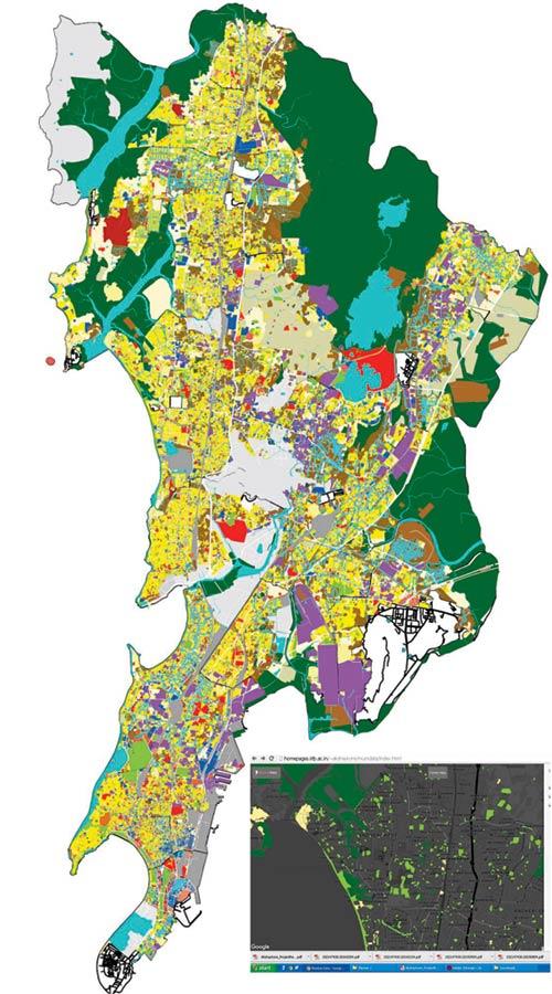
The MCGM’s multi-layered map of the existing land use plan, and a screenshot of Mumbai Data Map, showing urban villages (yellow), green spaces (light green) and forests (dark green)
From IIT-Bombay’s Industrial Design Centre comes a nifty tool to beat the maze. It’s an attempt to ease ploughing through dense data on government websites. Akshay Kore, a 24-year old final year student of interaction design, has developed Mumbai Data Map (www.mumbaidata.in), a website that puts across the MCGM’s existing land use (ELU) plan in easy-to-use fashion.
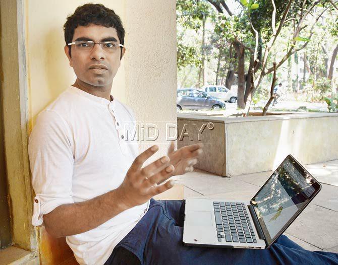
Akshay Kore. Pic/Satej Shinde
“Often, Indian administration websites have information for the public, but they are far from accessible. For instance, locating the DP 2034 folders on the website is difficult, and once you do, the maps are all in PDF format. The information is on one multi-coloured map; filtering data is arduous,” said Kore, who devised the map over eight months as his thesis project, using both MCGM and private data, under the guidance of Prof Venkatesh Rajamanickam.
Mumbai Data Map deconstructs the ELU plan into different legends and colour codes as prescribed by the MCGM, allowing users to pick what they wish to see on the map. A visualisation sidebar to the right provides options including urban villages, swimming pools, municipal chowkies, education and so on. Moreover, saturation and lightness levels on the map can be adjusted. “I kept the interaction levels simple knowing that not everyone is tech savvy. The map can be used by architecture students, city planners and activists. It is also simple enough for the general public,” he said, Kore, who in 2013-14 interned as a junior urban designer, had faced clunky websites and saw associates forced to manually trace information from MCGM maps. Rajamanickam, who teaches data visualisation at IDC, added, “If an urban planner or researcher has to analyse a problem, data has to be easily accessible. This map gives an idea of green spaces, areas lacking schools and medical facilities, and so on. We hope that government authorities will get interested and willing to part with information in a way that it is useful.”
Going ahead, Kore, who is still tweaking the map (it also has a layer called 26th July Floods which will be animated), plans to approach the civic body to see if more support can be garnered. Hopefully, the map will then provide specific information and statistics on each of the areas, a job that other urban researchers will be keen to contribute to.
 Subscribe today by clicking the link and stay updated with the latest news!" Click here!