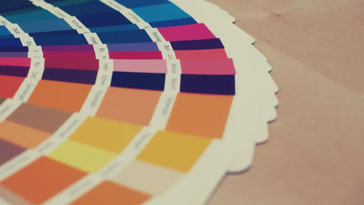
As the world awaits Pantone’s 2026 Colour of the Year, here’s a look at the last five shades and what each revealed about global moods and cultural shifts

Image for representational purpose only. Photo Courtesy: File pic
Each year, Pantone’s Colour of the Year reflects where the world stands — socially, culturally, and emotionally. As we look forward to the announcement for 2026, it’s worth revisiting the last five colours and the stories they told.
2025 – Mocha Mousse (PANTONE 17-1230)
In 2025, Pantone chose a rich, warm brown inspired by cacao, coffee, and natural earth. Mocha Mousse reflects a yearning for comfort, groundedness, sensual pleasure, and a deeper connection to nature. The “thoughtful indulgence” it represents signals a collective craving for quiet luxury, sustainability, rootedness, and timelessness — perhaps as a response to years of upheaval and digital overload.
2024 – Peach Fuzz (PANTONE 13-1023)
Peach Fuzz is a soft, warm peach tone symbolising warmth, compassion, connection, and calm. It suggested a collective desire to reset — to move from bold self-assertion toward softness, care, and togetherness. The shade encouraged valuing comfort, kindness, and emotional wellbeing, both personally and socially.
2023 – Viva Magenta (PANTONE 18-1750)
Viva Magenta resonated as a declaration of energy, joy, and fearless self-expression. As the world emerged from the shadow of the pandemic, people sought reconnection, celebration, and renewal. This vivacious shade captured that exuberance — a “life-affirming” hue encouraging confidence, individuality, and embracing the present moment.
2022 – Very Peri (PANTONE 17-3938)
Very Peri, a periwinkle-toned violet-blue, was a brand-new shade introduced to represent “a blend of the physical and digital worlds”. As life increasingly integrated remote work, online communities, and virtual connection, Very Peri reflected an evolving reality — with one foot in tangible life and the other in the digital sphere. It signalled creative reinvention, adaptability, and techno-optimism.
2021 – Ultimate Gray (PANTONE 17-5104) and Illuminating (PANTONE 13-0647)
In the wake of the global pandemic, Pantone’s dual selection for 2021 captured the essence of resilience and hope. Ultimate Gray — steady, reliable, and grounding — paired with Illuminating, a bright, optimistic yellow, symbolised strength and light after hardship. Together, they expressed a longing for stability and optimism during uncertain times.
Pantone introduced the Colour of the Year program in 1999 to engage global design communities and highlight the influence of colour on culture. While Pantone has not yet officially announced the Colour of the Year 2026, industry speculation points to Transformative Teal — a blend of blue and aquatic green.
The predicted shade is expected to merge serenity with strength, making it suitable for diverse applications across fashion, interiors, and digital design.
 Subscribe today by clicking the link and stay updated with the latest news!" Click here!


